Thursday, December 25, 2008

10

Renders of the final product.

Wednesday, December 24, 2008

09

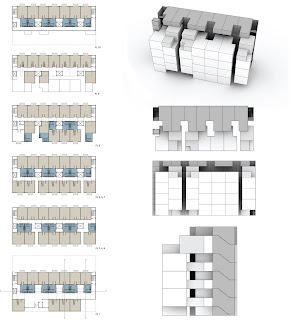
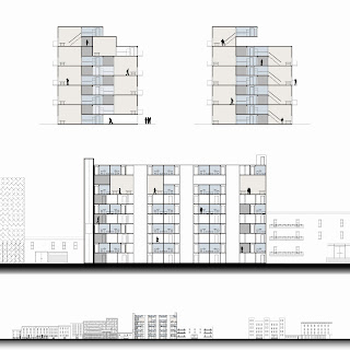
Illustrated in the first section is the ample gallery space in the corridors, as well as the gym and outdoor space. The second section shows the significant open art space on the ground floor, the light well that runs through the building, and the alternating stair cases that lead to the galleries within the corridors.

08

Realistic plumbling strategies and Americans with Disabilities Act regulations were a new concern for our designs. As seen in the first section, we designed for four riser pipes throughout the building. Also seen below are the three light wells.

The second section highlights the gallery spaces within the building, as well as the gym on the 9th floor, and facade on the 10th floor.

Monday, December 22, 2008

07

The ground floor and corridors were developed as with a variation of direct and optional circulation spaces. Upon entering the building, you're positioned in front of an information desk for the 1600 square foot gallery. The gallery space, illustrated with a blue tone, is wide spread throughout the building.

The elevator is to the left side of the building, with fire stairs to both the left and right. We added an additional set of skip-stop stairs at the front of the building, such to direct the occupants through the gallery spaces in the corridors. Taking the stairs on the ground floor would then require you to walk through the 2nd floor corridor to reach the next staircase.

The 8th floor marks the end of the gallery space, with yet another 1600 square foot open art space. The 9th floor features a gym for the students as well as numerous outdoor spaces.

(Due to .pdf to .jpeg conversion problems, the drawings lack material detail.)

Monday, December 15, 2008

06

The final units plans, renders and facade details.

To better utilize space, the units were reconfigured as lofts. Each bedroom is 12' x 10', with 400 square feet for open studio/gallery space within every unit, as well as it's own private entrance to a balcony.

The facade was designed as a sliding, user-controlled light filter system. The detail illustrates the various operations of the three separate louver mechanisms and set of sliding operable windows.

Saturday, November 1, 2008

05

Below are the plans and sections from our midterm critique. As Nicole and I further configured the geometry of the units and floor plans, we found an opportunity to create three 12' x 8' light wells throughout the building.

Square footage was also available to create two open floor spaces from the main corridor to the front of the building. This allows the occupants to freely move through the 11' corridors to a larger open space.

A main component of both the unit and building as a whole is the "open art gallery" aspect. We compressed the units enough to allow flexible space in the corridors and the ground floor for a continuous gallery.

Wednesday, October 15, 2008

04

Due to the small size of the site and programmatic needs, my partner and I had to constantly reexamine the geometry of the unit. We both agreed from the start that the work and sleep space would be separate from one another. The units shown below include that aspect, along with variations of kitchen/bath locations.

The floor plan shown below was our "EUREKA!" moment. Once we settled on a general unit plan, which features a double height work and sleep space, we began to examine the layout of each floor. The geometry of the unit allowed us to stack them in an L formation, which left residual space between the units for additional social space in the corridors.

Friday, October 10, 2008

03

Both site analysis and our precedent study dealt with void and volume relationships. The site analysis began with a figure ground study, looking at our site within the larger context of Clinton Hill, Brooklyn.

As we began laying out the units and developing floor plans, it became apparent that we should analyze the arrangement in a similar fashion. Through these various iterations, we found opportunities to fit additional program for the occupants.

The teal-blue renders depict an early massing model of our building, which illustrates all 65 units within the site.

Wednesday, October 1, 2008

02

The site, on Grand Avenue in Brooklyn, in within the R6 zoning district. Similar zoning districts are used in areas with built-up, medium-density areas such as Brooklyn, Queens and the Bronx.

The site itself is 150' (wide) x 100' (deep), however; only 150' x 70' is buildable, per the zoning code. The remaining 30 feet can be designed as a backyard/public space as the program and design develop.

The zoning code also requires that the building must be within a sky exposure plan, which begins at a height of 60 feet. The set-back after this point is 20 feet, as seen in the third image below.

This creates an unique challenge to accommodate for the required sixty-five 800 square foot dorm units within this limited space.

Monday, September 15, 2008

Fall 2008: 01

Course: Comprehensive Design I, Arch 301
Professor: Frederich Biehle
Partner: Nicole Grosso

Goal: Design a graduate housing building for Pratt Institute, located on Grand Avenue between Myrtle and Park in Brooklyn, NY.

Required: 65 units, 130 beds within the given site.

Sunday, May 4, 2008

23

The final model; structure encapsulating program and 'opened'/'closed' skin conditions.


22

Study model; continuing to form and change scale of the pattern according to program.


21

Study model; experimenting with transparency or a lack thereof in the skin pattern and shaping the patterns to my initial program studies.


20

Study model; an envelope of the site restraints and overlapping skin/structure patterns.


19

Study models; using both the skin and structural pattern.


18

The final product.


17

Plans; showing the specifics of the structure. The skin pattern creates a solid mullion and the 'open'/'closed' component of the skin creates a window. The dotted lined notate the overhang of the oblique walls. The structure pattern overlaid on the floor creates a glass tiling system, as shown previous here. Sections; highlighting the overlapping program, structural system and 'open'/'closed' skin system.

16

Using the previous skin pattern, I created a rule-set where the aperture system of the building reacts to program. For instance, the stacks do not require light and thus the pattern is 'closed'. The reading and play areas require light, so the pattern is 'open'.
The lighter grey is 'closed' and the somewhat translucent darker grey shade is 'open'.

15

The resolution of structure, laid into the site context, - and the first introduction of skin. The original structural pattern is placed into the floor plates to create a glass tiling effect along the stacks/continuous circulation spaces.


14

Additional program studies, looking at the square footage requirements as a volume and stricter public/private and age devised spaces. By taking those requirements and arranging them according to previous programmatic goals, I discovered new sectional aspects of the program.


Friday, March 14, 2008

13

The first look at program, considering the traditional library scheme. Divided between age groups and private/public spaces. Then diagramming the supposed circulation, based on the outward movement of the e-coli swarm. Through further study of the relationships in program, I began to develop a structural section where program is joined.