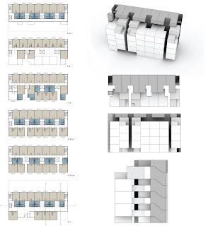
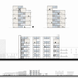
Square footage was also available to create two open floor spaces from the main corridor to the front of the building. This allows the occupants to freely move through the 11' corridors to a larger open space.
A main component of both the unit and building as a whole is the "open art gallery" aspect. We compressed the units enough to allow flexible space in the corridors and the ground floor for a continuous gallery.


No comments:
Post a Comment